We believe in the power of templates. They are there to promote consistency and efficiency, but sometimes they can also feel limiting. For this reason, we have introduced various functionalities. In this article, you’ll learn how to create truly flexible templates using these features.
Solutions Consultant Niels Veldman shares three tricks to give your templates the necessary flexibility:
- Template Variants (to prevent a proliferation of templates)
- Conditional Elements
- Scalable Text
Create variants
By creating variants, we don’t mean an endless list of templates. It’s easy to lose the forest for the trees that way. Instead, we advocate for smartly linking different template variants to a master template. What do we mean by that?
This means that users of your portal won’t have to sift through a huge list of templates and will experience more flexibility when filling in the template.
“It gives you the flexibility to effortlessly switch from one layout to another without losing your already entered content,” says Niels. “If you decide halfway through creating a square social media post that you want to switch to a 1200 x 627 pixels variant, you can do so with a click of a button. Your image is cropped, and your title and logo are positioned correctly.” Convenient, right?
Here are a few examples. You could offer social media templates in your Brand Portal as follows:
- Social post 1200 x 627
- Social post 627 x 1200
- Social post 1080 x 1080
- Social post 1200 x 1200
Now imagine also linking different formats, such as a post for job vacancies, one for events, and one for a whitepaper. You get the idea: it quickly becomes overwhelming.
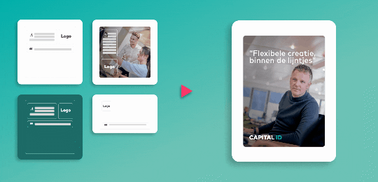
One Template, Multiple Layouts
We prefer to let users choose the type of post they want to create, such as an event invitation, an introduction of a new employee, or a job vacancy post. Let’s choose the last one to visually demonstrate how this looks.

The result is that now only one template is visible, linked to four formats. That clears things up nicely.
Ensure flexibility in layout
Another example, now for print. Suppose you’re writing an A5 flyer and realize you need more space for your text. You can easily change the size and layout from A5 to A4.
Conditional elements
“When you try to build flexibility into templates, you’ll inevitably face new challenges. For instance, you might want to give employees the option to display or hide their phone number on their business card. What do you do with that nice ‘phone icon’ if no number is entered?
With conditional elements, you link the phone number input field to the icon in the business card template. If that input field is empty, the icon is automatically hidden.”
Scalable text; when it almost fits
Another common frustration with templates is “when the text just doesn’t fit.” It’s annoying, we understand. “That’s why we recommend always setting a range for font size when creating a template in our Template Builder.”
You can, for example, add a slider that allows the user to adjust the text size within the set boundaries, or you can let the system do it automatically. Super handy and it saves a lot of frustration.
Balance between flexibility and consistency
Niels: “We’re always looking for a good balance between flexibility and maintaining consistency. With Template Variants, you increase the scalability and flexibility of your templates. And you give the end-user choices. This ensures a pleasant and more flexible experience for your end-users, with a consistent output as a result.” Win-win.
Want to see these features live? Schedule your demo now.